Saw this postcard in the library by Amz Kelso which featured dinosaurs in the shape of a heart on a mint green background and it really appealed to me because it was cute, humorous, modern and a little abstract.
Got me thinking: what kind of design is appealing to teenagers? Don’t know about boys, but I definitely think CUTE really catches the girls attentions.
Thought I’d be a copycat (haha! Copycat! Yes, I’m lame) and do the same type of thing,
Thought I’d be a copycat (haha! Copycat! Yes, I’m lame) and do the same type of thing,
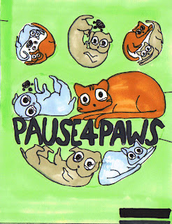
This inspired Concept 1:
Cute, fuzzy, cartoon animals, with oversized eyes that are filled with tears. The heart shape is also good because in order to fit the animals into the shape I had to make them be in awkward positions like embryos which I think actually adds to the effect, making them look helpless and baby-like.
Came up with the slogan “Pause for Paws” the other night which was partly inspired by the Rspca poster with the slogan, "Tips for Tails". This inspired Concept 2, A Paw Print filled with smaller paw prints and MASSIVE writing in the middle to catch the viewer's attention. Decided simple colours would be best for this type of thing, with so much other stuff going on in the poster:
And the finally, concept three: an integration of concepts one and two! woooo! That basically explains it all....
I only realised after I drew the paw that paws actually have four circly things at the top! (whoops) how could i get something like that wrong!


No comments:
Post a Comment