Wednesday, 30 March 2011

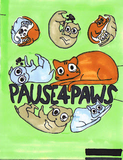
MY POSTER IS FINISHED! (exciting, isn't it?!)

yupp, finally. after weeks and weeks of hard, hard work and fun, the poster is finished!
And just to be boring i guess i'll also include my rationale, just to justify things and make the why's and how's of my design a bit clearer:


Rationale-  "The concept for my RSPCA poster design was to appeal to people through the cuteness of animals. Current advertisements of the RSPCA used dark colours and sinister themes, so I decided to do the opposite. I used the slogan, “Paws4Pause” because it was catchy and easy to remember. The style of the cartoon cats and dogs were influenced by the style of animals on hardcore tshirts (see blog) that used bright colours and bold outlines. These tshirts are popular amongst teenagers so I replicated the style, hoping that the style would catch the attentions of teenagers. The heart shape is an emotive image, which is not only cute, but also portrays the deeper meaning behind the poster; that animals need love and attention too. This is further highlighted by the “puppy dog eyes” of the animals, speech bubbles with hearts inside them, showing the cats and dogs yelling for love and the positions of the animals; they are like fetuses, vulnerable and helpless, needing people to show them love and attention.

In my design I incorporated many elements and principles. Firstly, the colour choice used was bright and bold, analogous colours for the animals and green for the background which gives the poster a happy feeling. Grassy texture was used to portray the nature of animals, like how they like to run and roll around outside. The outlines were bold and dark, bringing forth the images, and shape was used (the heart, the circular eyes). Repetition of colours, animals, shapes and style were also used. The main image was in the center of the page, and the slogan in the center of this, so that it could be the focal point of the poster.
The majority of the poster was made in Adobe Photoshop. The clone pattern brush, different textures, brush effects and layers were used. The image was made by first drawing it out then scanning it into the computer and making it into a stamp. The RSPCA logo was drawn in Adobe Illustrator.
Overall, the poster is appealing because of the cuteness of the puppies and kittens on the poster. Also, because of the way they are arranged (in a heart) and their puppy dog eyes. These aspects of the poster were enhanced through the use of different design principles and elements. "

Some inspiration- PUPPY DOG EYES.


Some more RSPCA shite.

Here's a few more examples of advertisements for the RSPCA:


Not current, but fairly recent. I've noticed they like to use pictures of animals (funnily enough)

Just some questions and answers:

The RSPCA! Who are they?!  What do they do?!  What does their current advertising look like, and what is their usual target demographic?!

The RSPCA is a community based charity which fights for the rights of animals and against animal cruelty. The Rspca promotes care and protection of animals.They include services such as providing shelters for homeless animals and  advice for petowners. Current advertising is relatively dark in colour (to show the darker side of animal cruelty, I guess) and include pictures of animals (obvs). there are some current advertisements which have cute animals on them. Target demographic: everyone? not really a certain demographic, but definitely the general public and especially animal lovers.

Sunday, 27 March 2011

Yet Another Class Excercise- Perspective Drawings and such

In class we did some drawing excercises on one, two and three point perspective. I found these relatively easy because I had done perspective drawings before in my other design classes.

Here's a perspective drawing of my name:


And here's a perspective concept of a cardboard chair I'm making in design & manufacture:


Here's the cardboard chair, not quite finished yet, but it does! sorta look like my picture!

Friday, 25 March 2011

Final Design thing, I suppose?

I'm gunna somehow scan this onto the computer and edit it so it turns out looking cool! (I hope!)

Concepts for a poster design!

Saw this postcard in the library by  Amz Kelso which featured dinosaurs in the shape of a heart on a mint green background and it really appealed to me because it was cute, humorous, modern and a little abstract.
Got me thinking: what kind of design is appealing to teenagers? Don’t know about boys, but I definitely think CUTE really catches the girls attentions.

Thought I’d be a copycat (haha! Copycat! Yes, I’m lame) and do the same type of thing,
This inspired Concept 1:
Cute, fuzzy, cartoon animals, with oversized eyes that are filled with tears. The heart shape is also good because in order to fit the animals into the shape I had to make them be in awkward positions like embryos which I think actually adds to the effect, making them look helpless and baby-like.
Came up with the slogan “Pause for Paws” the other night which was partly inspired by the Rspca poster with the slogan, "Tips for Tails". This inspired Concept 2, A Paw Print filled with smaller paw prints and MASSIVE writing in the middle to catch the viewer's attention. Decided simple colours would be best for this type of thing, with so much other stuff going on in the poster:


And the finally, concept three: an integration of concepts one and two! woooo! That basically explains it all....


I only realised after I drew the paw that paws actually have four circly things at the top! (whoops) how could i get something like that wrong!

Thursday, 24 March 2011

Class Drawing Exercise 1. Still-lifes and stuff.

We did still-life drawings of a cardboard chair, pile of magazines, basketball, and Tupperware. The first drawing we got 10 min to complete, then we had to do a one-line drawing where our pen was not allowed to leave the page. This gave the picture an interesting effect where it looked sketchy and abstract. The objects did not look like objects but the extra lines gave it an interesting effect. Then we got less and less time to complete our next line drawings. As a result, the pictures got crappier and crappier with less and less detail. Towards the end, this picture just looked like a series of lines and the subject matter was hardly recognizable.
From this:

To this:


Yes, this is the final one- just scribbles, but so fun.


Friday, 18 March 2011

INSPIRATION- band tees :)

Like, most of my wardrobe consists of band tees, i reckon.  I , personally only buy some of the tshirts for the band, but some of the designs are seriously pretty coooooool. Hardcore bands like gory, gory cartoon stuff :) I don't know why, but it's just appealing to the teenage market.


RSPCA - "for all creatures great and small"

The RSPCA is a community based charity that works to prevent cruelty to animals by actively promoting their care and protection.

Mission:
To prevent cruelty to animals by actively promoting their care and protection.
Vision:
To be the leading authority in animal care and protection.
Objectives:
The objectives of the RSPCA in Australia are:
·         To prevent cruelty to animals by ensuring the enforcement of existing laws at federal and state level.
·         To procure the passage of such amending or new legislation as is necessary for the protection of   animals.
·         To develop and promote policies for the humane treatment of animals that reflect contemporary values and scientific knowledge.
·         To educate the community with regard to the humane treatment of animals.
·         To engage with relevant stakeholders to improve animal welfare.
·         To sustain an intelligent public opinion regarding animal welfare.
·         To operate facilities for the care and protection of animals.

Some current advertisements for the RSPCA:


"Help Neglected animals leave their old lives behind"
I thought these ads which showed animals "zipping out" of their old skins were very clever. From a distance though, the colour choice made the posters appear dull, but this may have been on purpose. The posters have good layout and the viewer's eye is immediately drawn to the image in the centre.


"Show us some love. We'll return the favour"
These ads show animals doing human chores such as cleaning the floor and vacuuming the sofa. I didn't really get these ones. Will the animals return the favour by helping you do housework? Or is the poster trying to say "Stop being cruel to animals and treating them like slaves"? I really don't understand it. Once again, the colours are pretty dull and the writing is also hard to read.


"Tips for Tails"
I liked this poster because it was cute, positive, simple and the slogan whihc showed alliteration was very catchy. The above ad with the guinea pig or something running across the screen was unclear in its message though.

Tuesday, 8 March 2011

Caricature

From this:


To This:


Pink hair, pink docs, short legs, oversized jersey and a comical facial expression. Typical me.
Illustrator is so fun! Once you get used to using the pen tool, that is. I think the hardest part was learning how to use it because you have to click and drag. Definitely will use illustrator again for designing things! It's just like drawing, but on the computer and you can add cool effects with the click of a button instead of having to spend hours and hours! Keen to learn how to do some cool effects and be able to make stuff like this:


Wednesday, 2 March 2011

Abstract Art

Our task was to design an abstract piece of artwork that could be used for an album cover or something. For mine, I chose to mainly use different shades of pinks, blues and purples, which are analogous (next to each other on the colour wheel).

Pink and Blue Smoke
For this design I made a photoshop brush of a wisp of smoke first. Then I used the liquefy tool to create the squiggly lines. Very simple, really. I think the end result looked like liquid, bubblegum flavoured fire.
Design Principles and Elements used:
  • Colour: Bubblegum pinks and dark purples and blues, analogous colours with different tones.
  • Contrast between the bright colours and dark background, which bought forwards the swirls, creating depth
  • Composition/ Layout: fairly symmetrical, even amount of subject matter on both sides
  • Line: The squiggly lines were created using the stamp and liquefy tool. It draws the eye to the centre of the page. The lines which overlap also create interest.
  • Texture: The liquefy tool really helped- it looks like liquid oozing into the centre or pink and blue flames.
  • Pattern and movement was created through the repetition of the squiggly lines- the smoke looks like it is oozing and moving and in action.

Bubbbbbbllleeeesssssss
For this design firstly I filled the background with a gradient of dark blue to light blue. I then adjusted the brush to the right setting so that it scattered and had different sizes. Adjustments were then made to the lighting of the different layers to create a glowing effect.
Design Principles and elements used:
  • Colour: once again, I chose to used pink and blue. I really like those colours together for some reason. I think it's cause it remind me of a sunset :)
  • Gradient: The right side of the page is a dark blue and subetly changes to a lighter blue on the left side. The bubbles also have gradients which also give them form and make them look three dimensional.
  • Emphasis: I think the main focus of this design is at the bottom left hand corner because the tails of the bubbles make it look like the are going towards there
  • Repition of shape e.g the circles which are a variety of sizes to add interest.

Descriptive Imagery Evaluation

So today in Graphic Design we had to use descriptive imagery to make a map that only consisted of pictures which! Was actually pretty difficult, I must admit. These days we are so accustomed to reading that making and reading a map which solely consisted of pictures was hard. Niki chose the location our map had to lead to, which was the principal’s office. Choosing landmarks to draw to signal the way there was pretty simple, because there were distinct landmarks such as the mural of the two boys, the group of lockers, the staff toilets and the trophy cabinet. We also included numbers for guidance. The hardest part was trying to show that the final destination was the principal’s office. Finally we drew a lady with a graduating hat on (so she looked smart and because our principal is now female) standing behind a door- which said, “principal’s office” on it, only BACKWARDS.
The map which we had to follow was not very clear. I mean, the pictures were clear but the arrows were muddled up. We ended up doing a big lap of the school, before going to the S-block (where the media lab, the final destination, is situated). We didn’t actually realize where we were meant to end up, but we got close. Whether it was cause we weren’t familiar with that side of the school or just cause the pictures weren’t clear enough, I’m not sure. All I know is…reading maps with pictures only? Freakin’ hard!